Our Stay at the Santa Monica Proper Hotel: Architecture and Style before Burning Man
Before heading out into the desert to experience Burning Man, we decided to make a strategic stop at one of the most elegant places in Los Angeles: the Santa Monica Proper Hotel. This architectural gem not only offered us a much-needed break, but also left us in awe of its exceptional design, where historic architecture merges with modernity, creating a unique ambiance.
A Hotel with History and Vision
The Santa Monica Proper Hotel is a tribute to the blending of old and new. Located in the heart of Santa Monica, this hotel combines a historic 1920s building with a new contemporary structure in a design masterpiece by acclaimed architect Howard Laks. Laks was commissioned to renovate the original building, formerly the Santa Monica Professional Building, respecting its heritage while adding a new modern wing that perfectly complements the historic style.
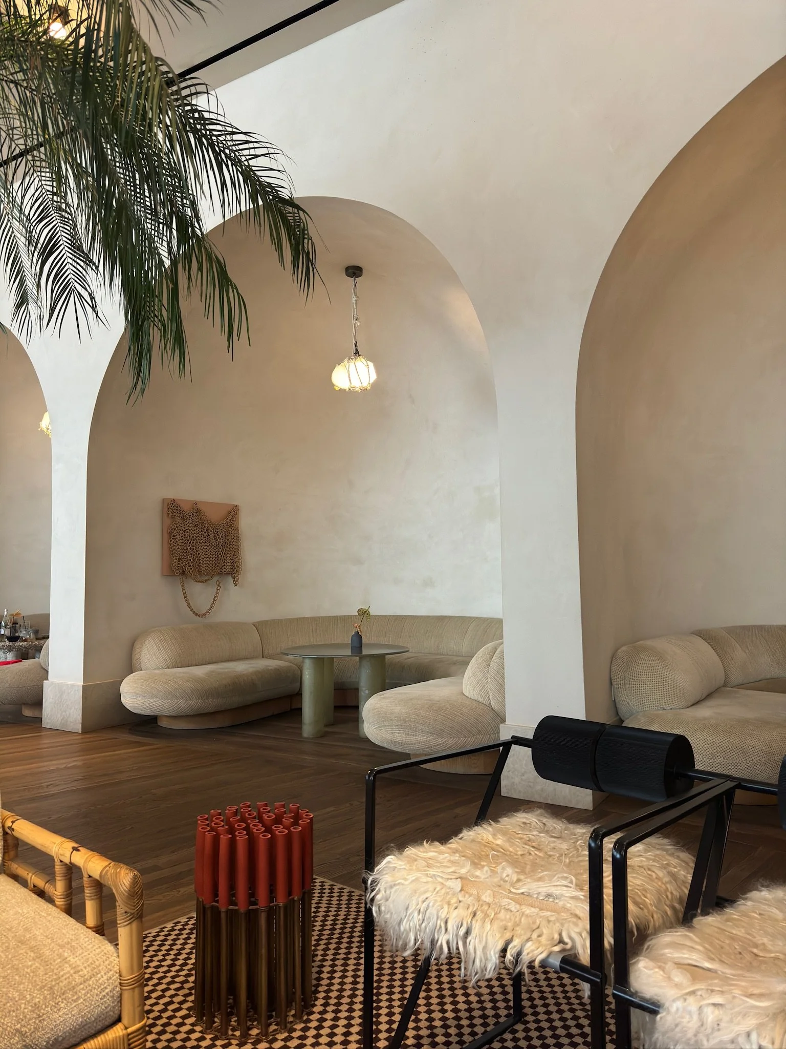
The elegance of the original building's facade, with its arches, ornate details and early 20th century charm, contrasts harmoniously with the new wing, which features clean lines and an undulating structure. This combination of classic and contemporary is what defines the Santa Monica Proper and makes it such a special space.
Kelly Wearstler's Touch: Dreamy Interior Design
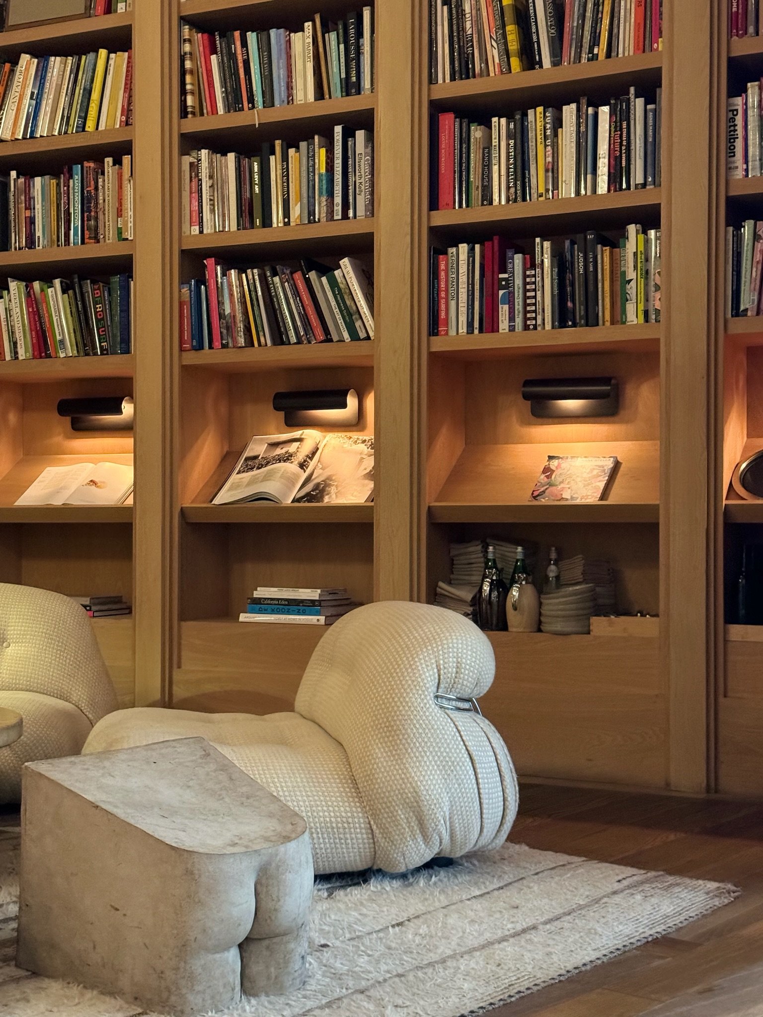
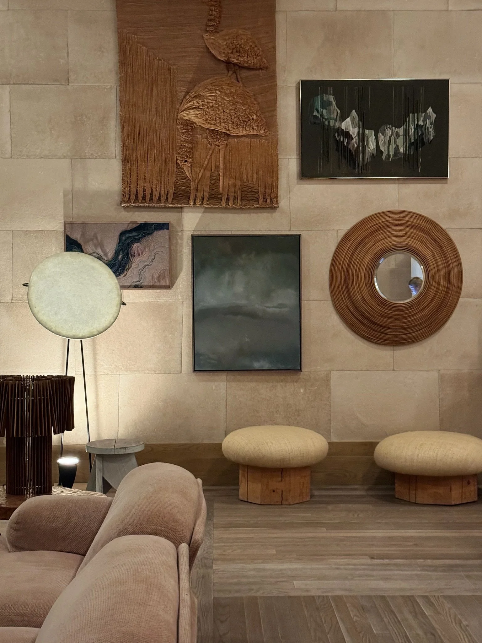
While the architecture of Laks is already impressive on its own, the interior design by the iconic Kelly Wearstler is what really elevates the experience inside the hotel. Known for her eclectic style and bold combinations of textures, Wearstler manages to create a warm, enveloping atmosphere that reflects both the coastal spirit of Santa Monica and the cosmopolitan sophistication one would expect in a place of this level.
The hotel's interior is filled with natural materials such as wood, stone and marble, which are intertwined with soft textiles and unique decorative elements. Every space, from the lobby to the guest rooms, seems designed to inspire tranquility and creativity, with a palette of neutral colors and earth tones that are perfectly complemented by the natural light that floods every corner.
Our room was a perfect example of this harmony of styles: large windows that let in the Pacific breeze, modern furniture and handcrafted details that added character to the decor. Kelly Wearstler's design was evident in every choice, from the organic shapes of the lamps to the leather and linen details that invited relaxation without losing elegance.
A Visual and Sensory Sanctuary
In addition to the rooms, the hotel has several common spaces that invite relaxation and contemplation. The rooftop of the Santa Monica Proper, with an infinity pool and spectacular views of the ocean, was certainly one of the highlights of our stay. Here, design remains key: modern, comfortable furnishings blend with local vegetation, creating a space that feels like a natural extension of the coastal environment.
We also took the opportunity to enjoy dinner at Calabra, the hotel's rooftop restaurant, where design and gastronomy meet in perfect harmony. Mediterranean cuisine is served in a setting that respects the minimalist yet warm aesthetic that defines the hotel, with sunset views that make any meal an unforgettable sensory experience.


